In this post, we’re going to see the implementation of the progress bar in Unity 3D and its different types. Before processed have a brief on the Unity 3D progress bar.
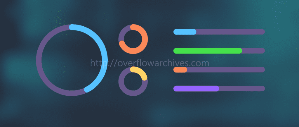
A progress bar is a graphical element used to display the progress of an activity. Such as progress loading, file transfer, file download, and installation. The progress bar supports two modes to represent the progress, determinate and indeterminate.
Different between this two-mode is determinate having a determined percentage from 0 to 100 or something related to a start and end value, and indeterminate progress mode doesn’t have any defined value to end the progress bar, it will load still the process success or failure result returned.
Determinate Progress bar
The Determinate progress bar is mostly used to show the progress percentage of any activity. It mostly accompanied by a textual representation of the progress in a percent format. Sometimes this progress bar will be used without any percentage textual information.
Indeterminate Progress bar
The Indeterminate progress bar is used when there is no defined time or percentage to end the progress. It will end when particular progress is completed. Both the Determinate and Indeterminate progress bar support circular and linear progress bar.
Linear Progress bar in Unity 3D – Determinate Progress bar
To create a Linear progress bar create a new scene. Right-click in the Hierarchy window and select Slider under the UI menu.
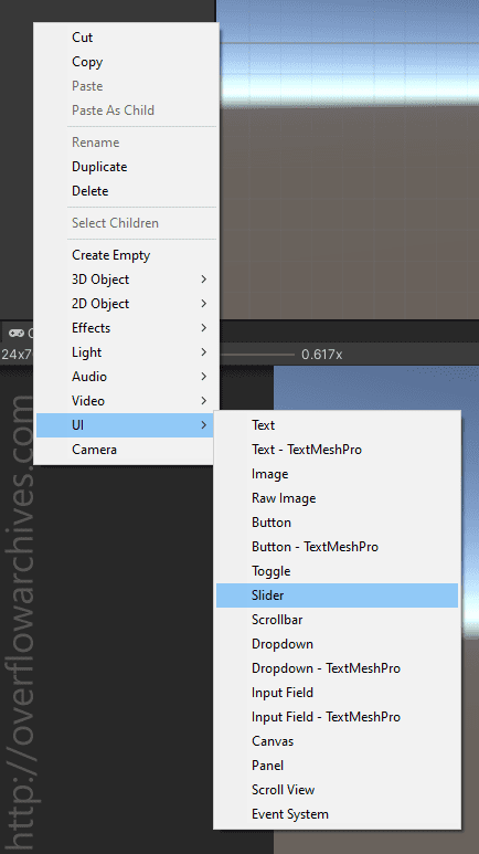
It will create a linear slider in the scene view as shown below.
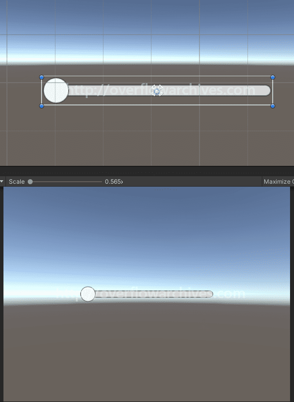
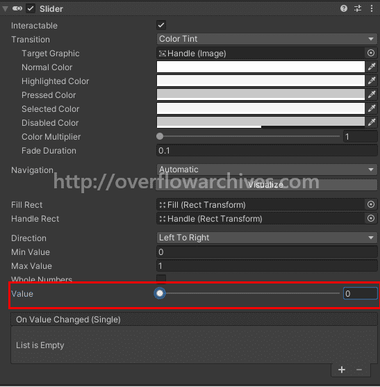
This linear slider fill value can be changed from the inspect window of the slider UI. The fill value ranges from 0 – 1 or 0 – 100 depends on the minimum and maximum value in the inspect window.
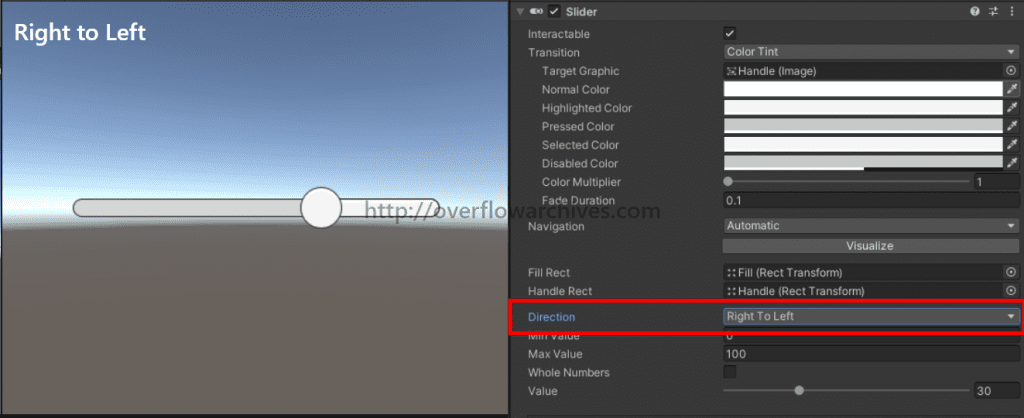
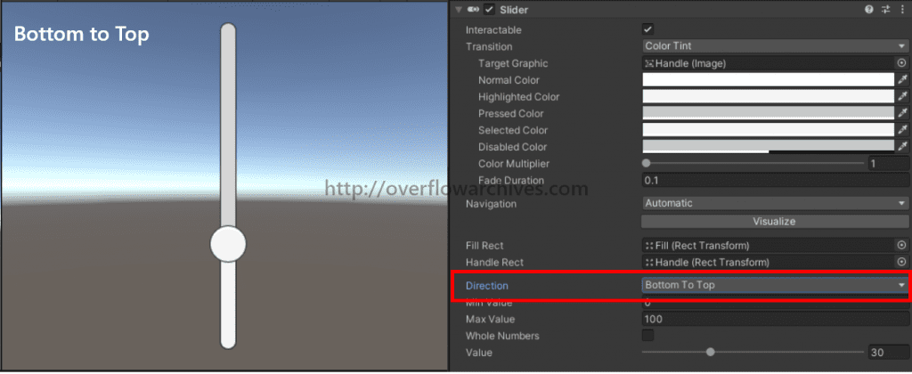
Also, the slider UI has different directions as Left to Right, Right to Left, Top to Bottom, and Bottom to Top. The flowing image will give you an idea of the different directions of the slider UI.


If you like to change the aesthetic of the slider, then expand the slider component in the scene window. Here you will find the fill area and handle elements. All the elements contain an image view, the color of each view can be changed. Also, it is possible to change it to custom images as need in the inspector window.
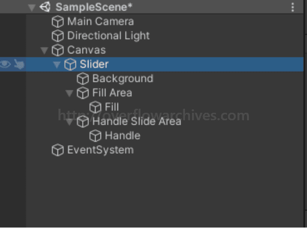
Changing the Linear Progress Bar Value
By default the slider UI has the method to change the fill value. The slide Handle support sliding function and it update the fill value based on the slider position.
Alternatively, we can update or change the slider fill value from a script. To do that create a C# script with a variable to hold the slider component. Then update the fill value for the slider inside the script.
Create a C# script as mentioned above, and attach the gameobjects. Now play the scene and you will see the slider value increasing by 10 percentage.
For Circular progress bar in Unity 3D please read here. Happy Coding!


